Client
Selfridges
Project type
Filter redesign
My role
Lead UX Designer
Project length
1 week sprint
Updating Selfridges PLP Filters
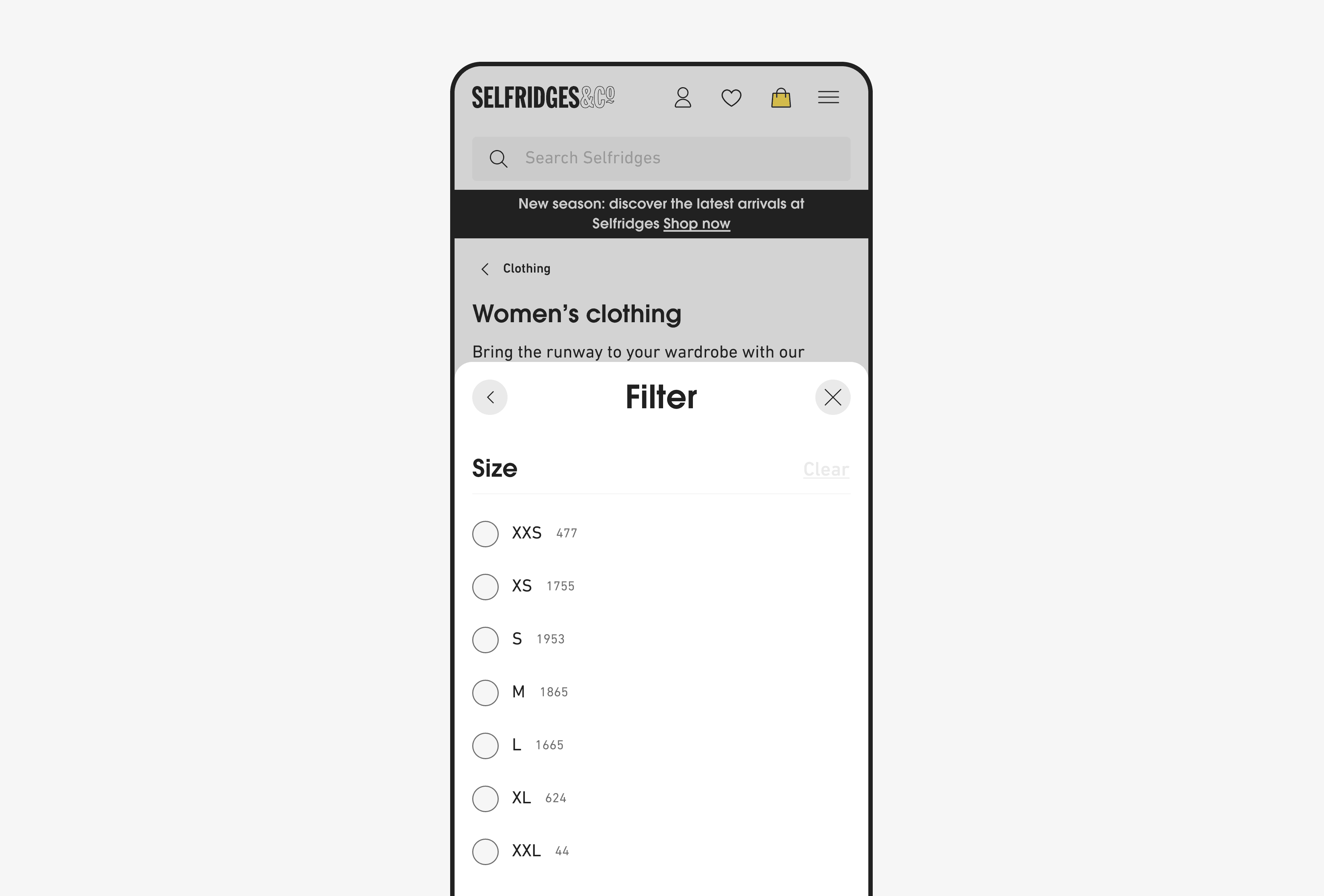
As part of an ongoing workstream to improve our filtering experience across our Product Listing Pages (PLP’s), we felt one way to do this was by having the filters for a specific category open by default (for example; size) when the user selects the filters. The thinking behind choosing size was that we’d acquired data showing the size filter generally tended to be the first one users opted for upon opening the filters. By implementing this we believed the filter categories would receive more engagement than if they opened in a closed state as the user would immediately be able to see the range of options available and not have to select one of the dropdowns.
Furthermore, we also felt that by designing options with the filters open, this would make it more obvious there were additional sizes available, and would subsequently make the entire experience more intuitive. If the various dropdowns only ever opened in a closed state it wouldn’t be obvious to the users we have additional sizes and they may miss out.
Business problems:
The business felt we could drive more engagement to our filters and dropdowns across our PLP’s and make them easier to use by implementing these changes.
This by extension would mean we could decrease the time from arriving on page to basket average for each customer and increase our conversion rates across PLP’s. This would also result in less drop-offs from our PLP’s as a result of frustration.
User/ design problems:
As a design team, we were always looking for ways to improve our filtering & navigation journeys, and were additionally always looking for ways to decrease the levels of friction across those journeys. Implementing this and taking the user immediately to a category we knew there was a lot of engagement with felt like a really big win.
Furthermore, data suggested that when users first opened our filters, the first drop-down they interacted with was generally the size filter. Mentioned above, but this does naturally add additional friction to their journey so from a user perspective we felt this was a part of the filtering journey we could immediately improve.
When conducting competitor analysis we also found that this was something most of them hadn’t implemented. Therefore, by implementing this change we felt this was an area where we were immediately getting ahead of the curve.
Opportunity & goals:
A big part of our Optimisation operation at Selfridges was always looking for ways we could improve the ways our customers interacted with parts of the site that naturally incurred friction, with filtering and navigation being two. The opportunity was clear; how could we make information we knew customers wanted more accessible and within fewer clicks?
Goals:
Improve the user experience of our filtering journeys by adding one less phase of interaction, and decreasing the amount of friction the user received from the point of first interacting with our filters.
According to data gathered by the analytics team, upon opening the filters, most users would then attempt to access the sizing options immediately. Redesigning this part of the journey allowed them to do that quicker.
Allow users to filter down the results of a search easier, find an item that bit faster, and ultimately purchase an item quicker.
Set a president for how we should look to define our filter journeys going forward and implement that across multiple journeys where data dictated what the most interacted with filter was across different categories.
Current filtering journey:
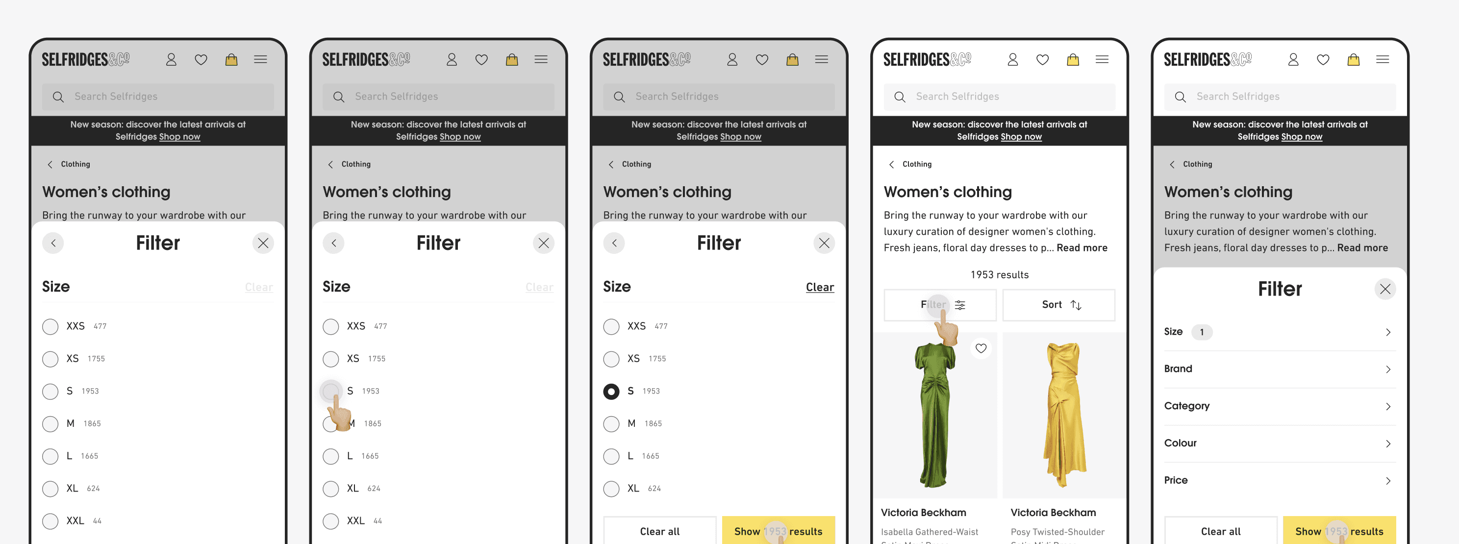
Screens below depict the current journey users underwent to access the filters. Highlighted in red are the ones we believed could be removed to lessen friction & taps. By removing these, and tweaking the journey to present the sizing options upon opening the Bottomsheet, from a user and business perspective we felt this presented an immediate improvement.

Updated filtering journey:
Can be seen below; arrows and touchpoints highlight all the interactions that happen within this updated journey. Note specifically the changes made when the Bottomsheet is activated and opens with the sizing options immediately available. We believe this was an excellent way to reduce friction and put the options the user wants right in front of them.

Testing:
We conducted an A/B test to see if the changes made any improvements. We designed the test to show one user group the screens with the updated changes, and one the current version of the PLP to see which one saw more interaction and had a higher ‘add to bag’ rate, and how long this took.
Final outcomes:
Overall, the experiment was a success. The Size filter usage rate saw a significant lift at 14.08%, rising from 2.77% in Control to 3.16% in the Experiment. Any further steps on this will be to continue to gather more data on the impact of the improved filters. The data in question would be the average time it takes a user to select a size, and how often products are added to the users basket after using these filters. This will be really useful in guiding us on how to make any further improvements.
As part of an ongoing workstream to improve our filtering experience across our Product Listing Pages (PLP’s), we felt one way to do this was by having the filters for a specific category open by default (for example; size) when the user selects the filters. The thinking behind choosing size was that we’d acquired data showing the size filter generally tended to be the first one users opted for upon opening the filters. By implementing this we believed the filter categories would receive more engagement than if they opened in a closed state as the user would immediately be able to see the range of options available and not have to select one of the dropdowns.
Furthermore, we also felt that by designing options with the filters open, this would make it more obvious there were additional sizes available, and would subsequently make the entire experience more intuitive. If the various dropdowns only ever opened in a closed state it wouldn’t be obvious to the users we have additional sizes and they may miss out.
Current filtering journey:
Screens below depict the current journey users underwent to access the filters. Highlighted in red are the ones we believed could be removed to lessen friction & taps. By removing these, and tweaking the journey to present the sizing options upon opening the Bottomsheet, from a user and business perspective we felt this presented an immediate improvement.
Testing:
We conducted an A/B test to see if the changes made any improvements. We designed the test to show one user group the screens with the updated changes, and one the current version of the PLP to see which one saw more interaction and had a higher ‘add to bag’ rate, and how long this took.
Final outcomes:
Overall, the experiment was a success. The Size filter usage rate saw a significant lift at 14.08%, rising from 2.77% in Control to 3.16% in the Experiment. Any further steps on this will be to continue to gather more data on the impact of the improved filters. The data in question would be the average time it takes a user to select a size, and how often products are added to the users basket after using these filters. This will be really useful in guiding us on how to make any further improvements.
Updated filtering journey:
Can be seen below; arrows and touchpoints highlight all the interactions that happen within this updated journey. Note specifically the changes made when the Bottomsheet is activated and opens with the sizing options immediately available. We believe this was an excellent way to reduce friction and put the options the user wants right in front of them.
Business problems:
The business felt we could drive more engagement to our filters and dropdowns across our PLP’s and make them easier to use by implementing these changes.
This by extension would mean we could decrease the time from arriving on page to basket average for each customer and increase our conversion rates across PLP’s. This would also result in less drop-offs from our PLP’s as a result of frustration.
User/ design problems:
As a design team, we were always looking for ways to improve our filtering & navigation journeys, and were additionally always looking for ways to decrease the levels of friction across those journeys. Implementing this and taking the user immediately to a category we knew there was a lot of engagement with felt like a really big win.
Furthermore, data suggested that when users first opened our filters, the first drop-down they interacted with was generally the size filter. Mentioned above, but this does naturally add additional friction to their journey so from a user perspective we felt this was a part of the filtering journey we could immediately improve.
When conducting competitor analysis we also found that this was something most of them hadn’t implemented. Therefore, by implementing this change we felt this was an area where we were immediately getting ahead of the curve.
Opportunity & goals:
A big part of our Optimisation operation at Selfridges was always looking for ways we could improve the ways our customers interacted with parts of the site that naturally incurred friction, with filtering and navigation being two. The opportunity was clear; how could we make information we knew customers wanted more accessible and within fewer clicks?
Goals:
Improve the user experience of our filtering journeys by adding one less phase of interaction, and decreasing the amount of friction the user received from the point of first interacting with our filters.
According to data gathered by the analytics team, upon opening the filters, most users would then attempt to access the sizing options immediately. Redesigning this part of the journey allowed them to do that quicker.
Allow users to filter down the results of a search easier, find an item that bit faster, and ultimately purchase an item quicker.
Set a president for how we should look to define our filter journeys going forward and implement that across multiple journeys where data dictated what the most interacted with filter was across different categories.
Project type
Filter redesign
Client
Selfridges
My role
Lead UX Designer
Project length
1 week sprint
Updating Selfridges PLP Filters
Project type
Filter redesign
Client
Selfridges
My role
Lead UX Designer
Project length
1 week sprint
Updating Selfridges PLP Filters
As part of an ongoing workstream to improve our filtering experience across our Product Listing Pages (PLP’s), we felt one way to do this was by having the filters for a specific category open by default (for example; size) when the user selects the filters. The thinking behind choosing size was that we’d acquired data showing the size filter generally tended to be the first one users opted for upon opening the filters. By implementing this we believed the filter categories would receive more engagement than if they opened in a closed state as the user would immediately be able to see the range of options available and not have to select one of the dropdowns.
Furthermore, we also felt that by designing options with the filters open, this would make it more obvious there were additional sizes available, and would subsequently make the entire experience more intuitive. If the various dropdowns only ever opened in a closed state it wouldn’t be obvious to the users we have additional sizes and they may miss out.
Business problems:
The business felt we could drive more engagement to our filters and dropdowns across our PLP’s and make them easier to use by implementing these changes.
This by extension would mean we could decrease the time from arriving on page to basket average for each customer and increase our conversion rates across PLP’s. This would also result in less drop-offs from our PLP’s as a result of frustration.
User/ design problems:
As a design team, we were always looking for ways to improve our filtering & navigation journeys, and were additionally always looking for ways to decrease the levels of friction across those journeys. Implementing this and taking the user immediately to a category we knew there was a lot of engagement with felt like a really big win.
Furthermore, data suggested that when users first opened our filters, the first drop-down they interacted with was generally the size filter. Mentioned above, but this does naturally add additional friction to their journey so from a user perspective we felt this was a part of the filtering journey we could immediately improve.
When conducting competitor analysis we also found that this was something most of them hadn’t implemented. Therefore, by implementing this change we felt this was an area where we were immediately getting ahead of the curve.
Opportunity & goals:
A big part of our Optimisation operation at Selfridges was always looking for ways we could improve the ways our customers interacted with parts of the site that naturally incurred friction, with filtering and navigation being two. The opportunity was clear; how could we make information we knew customers wanted more accessible and within fewer clicks?
Goals:
Improve the user experience of our filtering journeys by adding one less phase of interaction, and decreasing the amount of friction the user received from the point of first interacting with our filters.
According to data gathered by the analytics team, upon opening the filters, most users would then attempt to access the sizing options immediately. Redesigning this part of the journey allowed them to do that quicker.
Allow users to filter down the results of a search easier, find an item that bit faster, and ultimately purchase an item quicker.
Set a president for how we should look to define our filter journeys going forward and implement that across multiple journeys where data dictated what the most interacted with filter was across different categories.