Client
Selfridges
Project type
Site structure & journey analysis
My role
Lead UX Designer
Project length
3 weeks
Selfridges sitemap & category journey analysis

Overview:
The business needed an updated document to better understand the structure of the contents on the site, and understand the relationship between the front-end and back-end functionality of it. They also wanted analysis completed to gain a better understanding of some of the good & bad journeys across the site so we could look to improve them. By conducting a thorough audit of the site I was able to complete the first deliverable & by using journey analysis tools, I was able to establish a pack of some of the journeys we should be focusing on, which I then presented back to the UX team.
I acted as the Lead UX Designer working closely with the Analytics team, as well as our contacts at Quantum Metrics.
Business problems:
An updated document detailing the overall structure of the site and hierarchy of contents, in the form of a Sitemap.
A detailed breakdown of some of our most popular user journeys across our category pages. In addition to this, the business also required a further breakdown of which of these journeys could be constituted as ‘good’ and ‘bad’ according to metrics such as session percentages & page views, bounce & conversion rates, and engagement times.
Final recommendations of which of these journeys we improve both in the short term & in the long term, as well as a plan of how to do so.
Opportunity & goals:
The project presented a unique opportunity to analyse and research our core user journeys like never before, and really gain an understanding of what was working and what wasn’t. From there I was able to take the lead in recommending exactly what we should do to improve those journeys, and build out business cases for how this would benefit the business both in the short, and long term. In addition to this was the opportunity to create a clear, thorough document detailing the structure of our site, and core sections and pages.
Goals:
Create a new Sitemap that details the true length and breadth of the site.
Conduct research for the UX team that detailed what our most common user journeys were across our category pages for further analysis.
Once I had that information; begin analysing those journeys to see how and where we could improve them.
How could we implement this across more categories & parts of the site in the long term?
Summary of process:
Audit of the site:
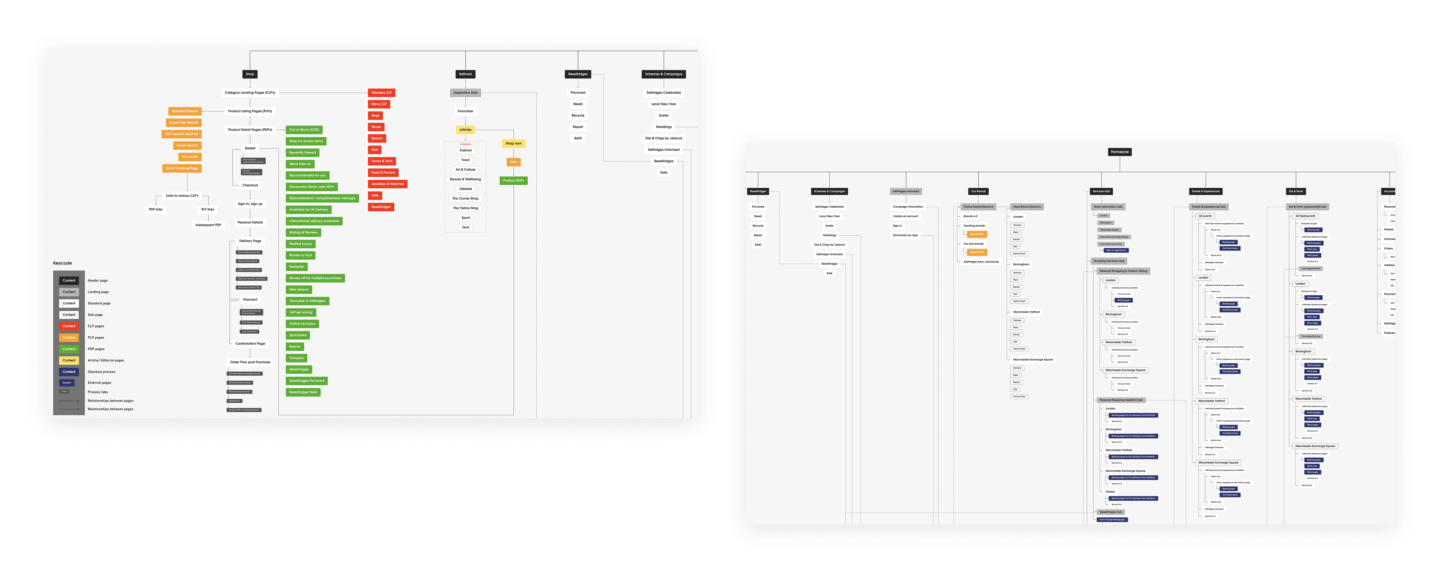
In order to build out a sitemap that reflected the true length and breadth of the site, I decided to conduct an audit of it. Within this, I detailed all the different parts of the site and all the various journeys our users would go on when they were, for example, completing a purchase, accessing our Editorial content, booking one of our services or into one of our restaurants, or accessing their account or customer service information etc.
Creation of the Sitemap:
Once I was happy with the above, and had checked with my Team Lead that I had everything I needed, I began building this out in FIGMA. Images of the final deliverable can be seen below.

Analysis of the category journeys:
This consisted of looking at metrics such as bounce & conversions rates, the percentages of page sessions that showed how users were arriving at these pages and where they went afterwards, page views and the average engagement times. All of these individual metrics would help us build out a bigger picture of how the users were interacting with these pages.
For example; if a PLP was recording a high bounce vs. conversion rate with quite high engagement times I may draw the conclusion that they are leaving those pages to access a PDP and are spending money. The high engagement time may also be an indicator they are taking their time going through the product lists to find the right product before going to the PDP. On the contrary, if the bounce rate was high and the conversion & engagement times were low, I may draw the conclusion they are bouncing around various pages because they can’t find what they are looking for, which would be a concern. The key here was to take this information & evaluate it based on what it was telling us and to also add context to how we know users tend to interact with these pages anyway. Doing this allowed me to make some really important and well informed conclusions.

Key takeaways:
The analysis was incredibly helpful, and highlighted issues with some of our core journeys across multiple categories, booking events & visiting the store, and others that needed addressing. Once I had this information, I was able to deliver a set of mini diagrams that illustrated this and broke down the ‘most common journeys’ by which ones were good, bad & indifferent, with some additional context wherever needed.
Next steps - plan for using this information to improve some of our user journeys:Having now established some of the journeys I felt we needed to look into, the next steps would be to map them out both in the form of Userflows and Friction Scores and see where we could make improvements.
Project type
Site structure & journey analysis
Client
Selfridges
My role
Lead UX Designer
Project length
3 weeks
Selfridges sitemap & category journey analysis
Overview:
The business needed an updated document to better understand the structure of the contents on the site, and understand the relationship between the front-end and back-end functionality of it. They also wanted analysis completed to gain a better understanding of some of the good & bad journeys across the site so we could look to improve them. By conducting a thorough audit of the site I was able to complete the first deliverable & by using journey analysis tools, I was able to establish a pack of some of the journeys we should be focusing on, which I then presented back to the UX team.
I acted as the Lead UX Designer working closely with the Analytics team, as well as our contacts at Quantum Metrics.
Business problems:
An updated document detailing the overall structure of the site and hierarchy of contents, in the form of a Sitemap.
A detailed breakdown of some of our most popular user journeys across our category pages. In addition to this, the business also required a further breakdown of which of these journeys could be constituted as ‘good’ and ‘bad’ according to metrics such as session percentages & page views, bounce & conversion rates, and engagement times.
Final recommendations of which of these journeys we improve both in the short term & in the long term, as well as a plan of how to do so.
Opportunity & goals:
The project presented a unique opportunity to analyse and research our core user journeys like never before, and really gain an understanding of what was working and what wasn’t. From there I was able to take the lead in recommending exactly what we should do to improve those journeys, and build out business cases for how this would benefit the business both in the short, and long term. In addition to this was the opportunity to create a clear, thorough document detailing the structure of our site, and core sections and pages.
Goals:
Create a new Sitemap that details the true length and breadth of the site.
Conduct research for the UX team that detailed what our most common user journeys were across our category pages for further analysis.
Once I had that information; begin analysing those journeys to see how and where we could improve them.
How could we implement this across more categories & parts of the site in the long term?
Summary of process:
Audit of the site:
In order to build out a sitemap that reflected the true length and breadth of the site, I decided to conduct an audit of it. Within this, I detailed all the different parts of the site and all the various journeys our users would go on when they were, for example, completing a purchase, accessing our Editorial content, booking one of our services or into one of our restaurants, or accessing their account or customer service information etc.
Creation of the Sitemap:
Once I was happy with the above, and had checked with my Team Lead that I had everything I needed, I began building this out in FIGMA. Images of the final deliverable can be seen below.
Analysis of the category journeys:
This consisted of looking at metrics such as bounce & conversions rates, the percentages of page sessions that showed how users were arriving at these pages and where they went afterwards, page views and the average engagement times. All of these individual metrics would help us build out a bigger picture of how the users were interacting with these pages.
For example; if a PLP was recording a high bounce vs. conversion rate with quite high engagement times I may draw the conclusion that they are leaving those pages to access a PDP and are spending money. The high engagement time may also be an indicator they are taking their time going through the product lists to find the right product before going to the PDP. On the contrary, if the bounce rate was high and the conversion & engagement times were low, I may draw the conclusion they are bouncing around various pages because they can’t find what they are looking for, which would be a concern. The key here was to take this information & evaluate it based on what it was telling us and to also add context to how we know users tend to interact with these pages anyway. Doing this allowed me to make some really important and well informed conclusions.
Key takeaways:
The analysis was incredibly helpful, and highlighted issues with some of our core journeys across multiple categories, booking events & visiting the store, and others that needed addressing. Once I had this information, I was able to deliver a set of mini diagrams that illustrated this and broke down the ‘most common journeys’ by which ones were good, bad & indifferent, with some additional context wherever needed.
Next steps - plan for using this information to improve some of our user journeys:
Having now established some of the journeys I felt we needed to look into, the next steps would be to map them out both in the form of Userflows and Friction Scores and see where we could make improvements.

Project type
Site structure & journey analysis
Client
Selfridges
My role
Lead UX Designer
Project length
3 weeks
Selfridges sitemap & category journey analysis


Overview:
The business needed an updated document to better understand the structure of the contents on the site, and understand the relationship between the front-end and back-end functionality of it. They also wanted analysis completed to gain a better understanding of some of the good & bad journeys across the site so we could look to improve them. By conducting a thorough audit of the site I was able to complete the first deliverable & by using journey analysis tools, I was able to establish a pack of some of the journeys we should be focusing on, which I then presented back to the UX team.
I acted as the Lead UX Designer working closely with the Analytics team, as well as our contacts at Quantum Metrics.
Business problems:
An updated document detailing the overall structure of the site and hierarchy of contents, in the form of a Sitemap.
A detailed breakdown of some of our most popular user journeys across our category pages. In addition to this, the business also required a further breakdown of which of these journeys could be constituted as ‘good’ and ‘bad’ according to metrics such as session percentages & page views, bounce & conversion rates, and engagement times.
Final recommendations of which of these journeys we improve both in the short term & in the long term, as well as a plan of how to do so.
Summary of process:
Audit of the site:
In order to build out a sitemap that reflected the true length and breadth of the site, I decided to conduct an audit of it. Within this, I detailed all the different parts of the site and all the various journeys our users would go on when they were, for example, completing a purchase, accessing our Editorial content, booking one of our services or into one of our restaurants, or accessing their account or customer service information etc.
Creation of the Sitemap:
Once I was happy with the above, and had checked with my Team Lead that I had everything I needed, I began building this out in FIGMA. Images of the final deliverable can be seen below.
Analysis of the category journeys:
This consisted of looking at metrics such as bounce & conversions rates, the percentages of page sessions that showed how users were arriving at these pages and where they went afterwards, page views and the average engagement times. All of these individual metrics would help us build out a bigger picture of how the users were interacting with these pages.
For example; if a PLP was recording a high bounce vs. conversion rate with quite high engagement times I may draw the conclusion that they are leaving those pages to access a PDP and are spending money. The high engagement time may also be an indicator they are taking their time going through the product lists to find the right product before going to the PDP. On the contrary, if the bounce rate was high and the conversion & engagement times were low, I may draw the conclusion they are bouncing around various pages because they can’t find what they are looking for, which would be a concern. The key here was to take this information & evaluate it based on what it was telling us and to also add context to how we know users tend to interact with these pages anyway. Doing this allowed me to make some really important and well informed conclusions.


Key takeaways:
The analysis was incredibly helpful, and highlighted issues with some of our core journeys across multiple categories, booking events & visiting the store, and others that needed addressing. Once I had this information, I was able to deliver a set of mini diagrams that illustrated this and broke down the ‘most common journeys’ by which ones were good, bad & indifferent, with some additional context wherever needed.
Next steps - plan for using this information to improve some of our user journeys:
Having now established some of the journeys I felt we needed to look into, the next steps would be to map them out both in the form of Userflows and Friction Scores and see where we could make improvements.
Opportunity & goals:
The project presented a unique opportunity to analyse and research our core user journeys like never before, and really gain an understanding of what was working and what wasn’t. From there I was able to take the lead in recommending exactly what we should do to improve those journeys, and build out business cases for how this would benefit the business both in the short, and long term. In addition to this was the opportunity to create a clear, thorough document detailing the structure of our site, and core sections and pages.
Goals:
Create a new Sitemap that details the true length and breadth of the site.
Conduct research for the UX team that detailed what our most common user journeys were across our category pages for further analysis.
Once I had that information; begin analysing those journeys to see how and where we could improve them.
How could we implement this across more categories & parts of the site in the long term?